Whether you are planning to follow my tutorial to create a free but expensive-looking author website, or hire a developer to build one for you, you will need to create some content before you get started. Here’s what you’ll need to create your brand identity and your starting content.
Branding
As part of your author branding, you will need to choose three fonts: your logo font, your heading font, and your body font. And then you should choose your color palette.
First, your logo font. You can use literally any font for this, since you’ll be creating your logo in a graphics program.
A quick and easy way to create a simple logo is with Google Drawings. I’ve got a sample one here you can save a copy of and edit.
I would normally recommend Canva for small graphics projects like this, but Canva charges extra if you want transparent backgrounds. A logo needs a transparent background to look right. But there are other apps you can use to great transparent backgrounds. On Windows, Paint 3D has a “Transparent canvas” option — it’s under “Canvas” on the far right of the screen. On the Mac, Paintbrush also has a transparency option. GiMP, the popular and free alternative to Photoshop has transparency, as does Photoshop itself. But unless you already know GiMP or Photoshop, I recommend using Google Drawing or Paint 3D or Paintbrush since it’s not worth learning a complex, heavy-duty piece of software for one simple task.
Above, on the left, you can see the transparent background on the logo. On the right, there’s a solid black background. You can see a black rectangle around the logo because the theme uses a dark gray background in the header. At first, I tried matching that dark gray color exactly, and gave up after a couple of tries. Then realized that even after I got a perfect match, I would have to redo the logo each time I changed the color palette. That’s too much work!
To create your logo in Google Drawing, click on “custom size” and, if you plan to follow my lead, go with 300 pixels wide by 96 high. I used the “Anton” font for my logo. It’s as simple and straightforward as it gets. Since the Rockfield theme has a dark gray header background, I also created a version of the logo with white text on a transparent background. You can see kind of how it looks like below, with the gray diamond background showing where the transparency would be:
I suggest creating both a black version of your logo and a white version, so you can use it in different places. I suggest keeping the background transparent in both cases, so you can put the logo on top of images and colored panels.
You don’t have to stick with the Anton font, either. Google has hundreds of other free fonts to choose from. It’s easy to go nuts.
Here are my recommendations for sci-fi, fantasy, and horror-themed author sites. But I also suggest that you can skip them. Plainer is better. But if you really really want to get fancy…
Sci-Fi Fonts
Fantasy Fonts
Horror Fonts
Remember that, whatever font you choose for your logo, the text itself should be clearly legible. You can also use a logo designer — Canva has one — to create a little image to go with the text, but most writer websites don’t have one.
For your body and heading fonts, go even simpler. The plainer the fonts, the classier and more expensive your site will look.
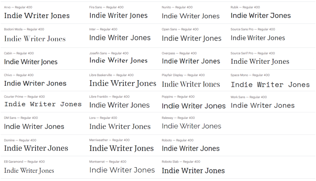
The Rockfield theme we will be using in the free website tutorial has the following font choices, any of which you could also use for your logo font for a clean, streamlined look. Here’s how “Indie Writer Jones” will look in each font:
For best readability online and on mobile devices, I recommend a plain, san-serif font for the majority of your text. Open Sans is a good choice, and one that many websites use. In fact, that is the font we use here at MetaStellar.
For the headline font, you could use the same font, or pick something slightly fancier. Chivo is a nice pairing, and that’s the I’m using for my tutorial, or Montserrat. Or you can use a serif font for the headlines, like Source Serif Pro, or Domine, for a little bit of visual contrast. I personally like using narrow fonts for headlines, like Roboto or Merriweather. At MetaStellar, we use Oswald for the headings, which is another narrow font, but it isn’t one of the free Rockfield theme options, at least, as of this writing.
Brand colors
The final step of your personal brand journey is to pick your brand’s color palette.
If you don’t have one yet, and don’t want one, feel free to stick with black and white. It always looks classy. You can add some gray as an accent color, or another neutral, like beige or taupe.
The Rockfield theme I recommend comes with five colors — black, white, two shades of gray, and a medium green accent color.
I recommend sticking with that, just changing that accent color. I like orange, because it really pops and goes with a medieval fantasy style. Blue and teal would be good for a futuristic feel, violet and purple would make for a nice romantic touch.
Once you’ve picked your main accent color, find its complementary colors to use for background colors on your home page panels, if you want to have extra color there. Many of today’s top author websites have different colored panels on the home page right now.
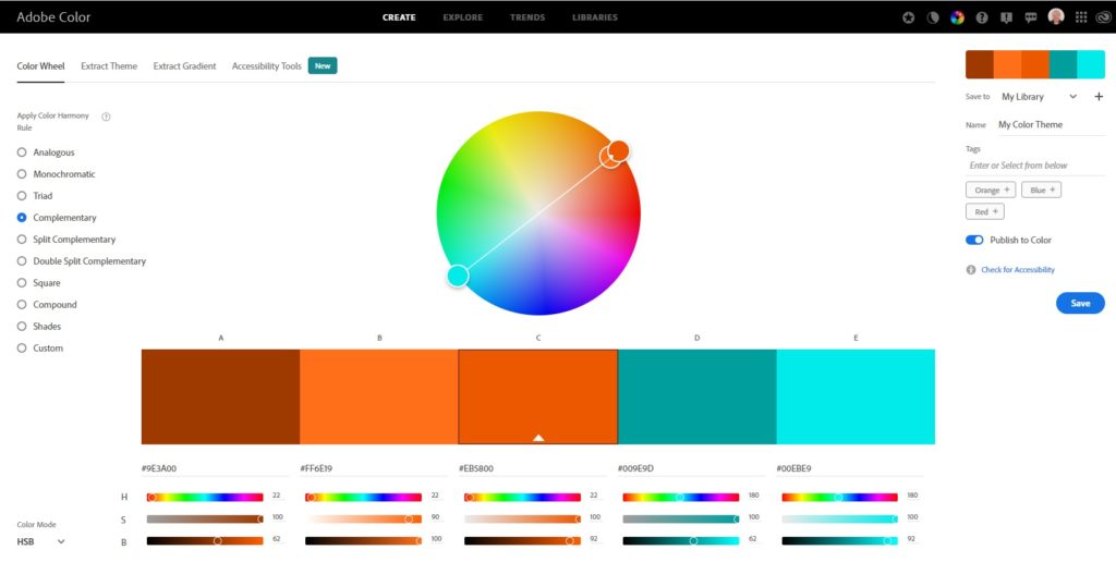
I use the Adobe Color Wheel to pick complementary colors, since I don’t have a good eye for color personally. So, if you go with orange, the complementary color is a shade of teal.
The complementary color is the one on the other side of the color wheel, and the same intensity, or saturation.
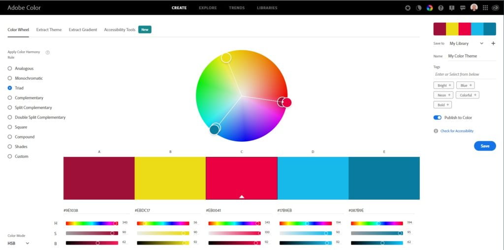
You can also choose your matching colors from a triad. For example, if my primary color is fuschia, then yellow and light blue would go well with it.
When you’re done moving the little circles around to pick your colors, write down the Hex codes. In the example above, the fushia is #EB0041, the yellow is #EBDC17, and the light blue is #17B9EB. I can see this color combination working well as background colors for home page panels for a cheerful paranormal mystery romance series, or a children’s fantasy.
Or you can pick an accent color from Pantone’s top colors of the 2021-2022 season.
If you have a favorite image that you plan to use, or if you want to use the same colors you have in your book cover, then use Canva’s free color palette generator. Just upload an image, and Canva will suggest a few colors that will go well with it.
Below, you can see Canva’s suggestions for colors that go with the MetaStellar cover image.
Don’t worry too much about picking just the right color, unless you’re into that kind of thing. Today’s top author websites have color schemes that are all over the board. Andy Weir has an orange accent. Dean Koontz uses slate blue. Brandon Sanderson has red and slate blue. Gail Carriger uses dark and light brown. James S. A. Corey uses orange, dark blue, and purple. Laurell Hamilton uses a fire engine red. Mary Robinette Kowal uses purple and light blue. Diane Duane has a few different shades of blue. Jackie Collins uses dark blue and brown as her accent colors. Michael Connelly has maroon and yellow. Harlan Coben uses a dark olive accent. Sandra Brown has a gold accent. Pierce Brown uses brown, red and tan. Holly Black uses light blue. Ilona Andrews uses maroon, dark teal, and pale lilac. J.K. Rowling is all shades of gray, with a wood surface background on her home page. And James Patterson uses lilac, yellow, and light blue.
So there’s no rhyme or reason there.
Feel free to use a muted, neutral color for your accent color, or go with something bright if you want.
But for the rest of the default colors for your website — the body text, the headers, the backgrounds — use black, white for all the main text and dark gray and light gray as additional options for headers and backgrounds.
Black and white is the most readable combination and goes with everything. If you do use colors, use just one color at a time. So, if you use red for your heading text, put it on a white background. Or if you have a red background, use white text. Do not put text of one color on a background of another unless you want your site visitors to hate you.
And when you do use colored text, or colored backgrounds, use it only for headings and buttons — your regular body text should always be black or white, or, at most, very very dark gray and white. Anything else would be difficult to read.
Nobody ever believes me, so here’s proof:
A simple base color palette of black, white and gray plus one accent color also has another benefit. If, at some point in the future, you want to change your site’s color palette, you’ll just need to reset the accent color and pick new background colors for the home page panels — probably ten minutes worth of work.
But if you have different colors for all your headings and other site elements you’ll have to go through and make sure that they all work together — and match the site images you’ve uploaded to all your posts and pages.
Text Content
Before you start with your site design, create some content. This can be filler content, just to work with while you get the site organized. Or it could be actual content.
Here’s a list of some of the must-haves:
- Your author bio. I recommend writing it in the third person, as if your agent or publicist wrote it for you.
- Your contact information. This could just be your emailing address, or a post office box, or your agent’s contact information. You could also use a form here, but in my experience, forms tend to break, and people tend not to like using them. If you’re worried about spammers getting your email address, well, I hate to break it to you, but they already have your email address.
- Blurbs. These are one or two-sentence descriptions of your books and stories.
- Testimonials and reviews. Has anyone ever said anything nice about you or your work? Collect it here.
- Sample chapters for book excerpt pages
- Sample short stories if you plan to share them on your site
- Three or four blog posts
Site Images
Today’s websites live and die by graphics.
Here’s what you’re going to need to get started:
- Your official headshot
- Images of your book covers
- Cover images for your short stories and blog posts
- Background images
Headshot
If you already have a professionally-made headshot, use that.
If not, and you’re tempted to just crop a square of your face from a random selfie, hold on. Many author headshots I see that were done that way have very low contrast between the face and the background. The face looks washed-out, and the background is the same general shade level. When it’s shrunk down to headshot size, it’s very hard to make out the face.
If you don’t have any good high-contrast selfies that makes your face pop, take some new pictures. Stand somewhere with a lot of light on your face. You can go outside in the morning, evening, or on a cloudy day. On a bright day, try to find an angle where the sun doesn’t wash out your face — maybe in the shade. Inside, find a spot near a window or do what I do, and just point a bunch of lamps at your face. I have several desk lights on my desk for my SAD. (It also helps with Zoom calls!) I take many of my selfies there.
By the way, if you have Zoom and good lighting at your desk, you can use Zoom’s record video feature to get some great headshots. Start a new Zoom meeting with just yourself, hit the record button, and adjust camera angles and lighting until your face is nicely visible. Then turn your face to different angles and play with different facial expressions. When you get sick of making faces at the camera, stop recording and close the meeting. Zoom will then convert the recording into a standard video, which you can open with Photos or any video app.
If you use Microsoft’s default Photos app, click on the pencil icon at the bottom right of the screen and under the “Edit in Photos” menu you’ll see the “Save photo from video” option. Click on that. Now you can go through your video frame by frame and save the best ones as your new headshots. Close the file, then open the new headshot using any image editing app — including Photos or Paint 3D or Canva — and crop into a square.
Pro tip: Zoom has a built-in “beauty” filter that will make you look extra pretty, as well as background options that you can play with.
You can also use an AI photo anonymizer to create an anonymized version of your headshot, in case you write under a pseudonym and don’t want to use your real photo. Another free site that lets you create unique, AI-generated headshots is LucidPic.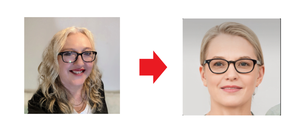
Here’s how that faked headshot will look in a bio box on my new home page:
Once you have your perfect headshot, you can create different versions of it to use everywhere. For example, you can make circular versions with cool background effects to use on social media and in your email signature (HubSpot has a great and free email signature generator.) Or you can strip out the background so you can layer your face over other graphics using a free online background removal tool.
James Patterson has a cool effect on his website where it looks like his image moves as you resize the background.
Book covers, blog post images and illustrations
You probably already have book covers made for your all your books. Use those.
If you don’t have covers yet, and want some temporary ones until you get around to hiring a designer or buying one on a pre-made covers site, you can use Canva’s free book cover maker. I wouldn’t recommend Canva for the final, Amazon-ready book covers, but here are a few covers I made up in a few minutes based on stock templates and photos to use as sample content for my Indie Writer Jones website:
They’re okay, I guess, for place-holder covers. But they would be great for short story covers.
For blog post illustrations, use Canva’s free banner templates if you want to combine images with text. Or just use Pexels Free Photos if you want stock images with no text or other graphics on them. Pexels, by the way, is built right into WordPress.com so, later on, you won’t even have to go anywhere else to find images.
For illustrations and pretty backgrounds, you can also check out Pixabay and Unsplash or create your own unique images with the help of AI tools.
Many of today’s top author websites use colorful, abstract backgrounds on their home page panels. Pixabay has hundreds of free abstract backgrounds.
Here’s just one random example:

Here’s a blue and green option:

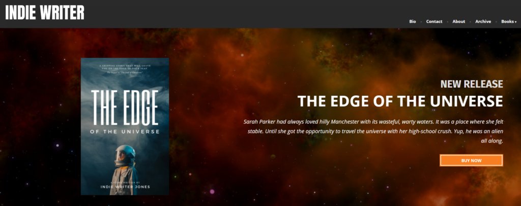
Here’s how that first background will look with a new book announcement:
And you can’t tell from the static, cropped screenshot image above, but I’ve actually set it so that the background has a parallax effect — it seems to move as you scroll the page up or down.
Looks fancy, right? Took hardly any time to do.
Next step
Once you’ve got your text written, your images collected, and your photos and colors chosen, you’re ready to make the site.
If you want to jump ahead and try to do it on your own, go to WordPress.com for your free site and use Rockfield for your theme. And you can look at how my work-in-progress demo site is going here.
Want to watch me go through it all for you? Check out the video below.

Edited by Melody Friedenthal
MetaStellar editor and publisher Maria Korolov is a science fiction novelist, writing stories set in a future virtual world. And, during the day, she is an award-winning freelance technology journalist who covers artificial intelligence, cybersecurity and enterprise virtual reality. See her Amazon author page here and follow her on Twitter, Facebook, or LinkedIn, and check out her latest videos on the Maria Korolov YouTube channel. Email her at maria@metastellar.com. She is also the editor and publisher of Hypergrid Business, one of the top global sites covering virtual reality.


