Update: I’ve posted a tutorial for how to set up a site that looks like one of these for free, here: Free author website: initial setup and a video walk-through on our YouTube channel.
When redoing a design of a website, it’s always a good strategy to research current design trends. That way, any website you build will look fresh and current, and you’ll get more mileage out of it than one built on design principles from five, ten, or fifteen years ago.
Often, it’s hard to put into words what makes one site look dated and another look fresh and current, so in this article I’m going to look at some website of big-name authors, who have big-time budgets — or whose publishers have big-time budgets — to invest in making good-looking websites.
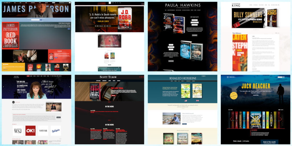
Here are my top picks for author websites that look like they’ve been recently professionally redone with cutting-edge, modern designs, across all genres:
- Ben Aaronovitch
- Ilona Andrews
- Katherine Arden
- Paolo Bacigalupi
- David Baldacci
- Iain M. Banks
- Holly Black
- Pierce Brown
- Sandra Brown
- Gail Carriger
- Karen Chance
- Lee Child’s Jack Reacher website
- Cassandra Clare
- Harlan Coben
- Michael Connolly
- Jackie Collins
- James S.A. Corey
- Michael Crichton
- Jeffery Deaver
- Diane Duane
- Steven Erikson
- Jeaniene Frost
- Elizabeth Gilbert
- Laurell K. Hamilton
- Paula Hawkins
- Khaled Hosseini
- Hugh Howey
- Dean Koontz
- Mary Robinette Kowal
- Victor LaValle
- Ann Leckie
- Brad Meltzer
- Karen Marie Moning
- Shelley Parker-Chan
- James Patterson
- George Pelecanos
- Terry Pratchett
- Alastair Reynolds
- Kat Richardson
- Nora Roberts and JD Robb
- Veronica Roth
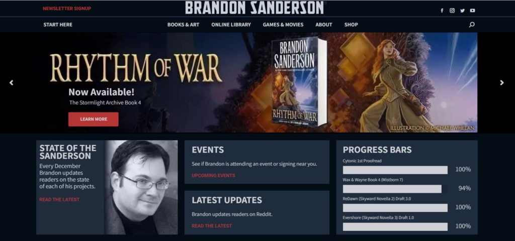
- Brandon Sanderson
- Felix R. Savage
- Daniel Silva
- Brad Thor
- Scott Turow
- J.R. Ward
- Brent Weeks
There are plenty of big-name authors whose websites look old-fashioned but are still pretty good. George R. R. Martin’s site comes to mind. Sometimes, this is deliberate, with the writer choosing to go for a retro feel. Most often, an old-fashioned-looking website simply hasn’t been updated for a long time, or was created by a designer who doesn’t keep up with the trends, or was hand-made by the author using the default options offered by their blogging platform.
But just the same way that buyers judge books by their covers, website visitors judge sites by their looks. A dated site can create the mistaken impression that website has been abandoned or that the author doesn’t care about it. Plus, the old, dated sites are difficult to read on mobile devices, are harder for search engines to navigate, and lack modern-day features like image sliders.
All of these sites, at first glance, look very different from one another. But if you compare them to the sites that haven’t updated in a while, you’ll start to see that the modern, professional-looking sites all have a few things in common.
They use WordPress, responsive design, wide horizontal sections, no sidebars, and bold, impactful colors and fonts.
1. WordPress
Every single site I listed above is a WordPress site. Not Wix, not SquareSpace, not Drupal, not Joomla, not hand-coded HTML. Just WordPress.
That doesn’t mean that there aren’t any writers out there using those other platforms, but they’re pretty hard to find. This wasn’t a shock to me. WordPress accounts for two-thirds of all websites that have content management systems. Every other platform is in the single digits when it comes to market share.
To find out if a website uses WordPress, you can use the free What CMS tool, and to find out which WordPress theme a site uses, check out the free What WP Theme Is That tool.
There are thousands of free themes available for WordPress and tens of thousands of low-cost commercial themes. Using a theme means that you don’t have to design a site from scratch — just install the theme, upload your images and text, and you’ve got a site. It usually take me a couple of hours to put up a basic site from scratch. (Then months, or even years, of fiddling with it to get it to look just right.)
Some authors have custom themes designed just for them. This probably cost them — or their publishers — quite a bit of money.
JK Rowling’s website has a custom theme called JKRowling. Jackie Collins’ website also has a custom theme, as does Daniel Silva’s website, Brad Thor’s website, Michael Connolly’s website, Laurell K. Hamilton’s website, Gail Carriger’s website, Cassandra Clare’s website, James S.A. Corey’s website, Alastair Reynolds’ website, Ann Leckie’s website, Terry Pratchett’s website, Dean Koontz’ website, Brent Weeks’ website, and Jeffery Deaver’s website.
Hachette has their own custom theme, that they use for all their authors, including Scott Turow, James Patterson, Iain M. Banks, George Pelecanos, David Baldacci, Sandra Brown, and Holly Black.
But many author websites use cheap or free off-the-shelf WordPress themes.
Nora Robert’s website and her JD Robb website both use the Busiprof Pro theme, which costs $59. And there’s a free version of the theme you can get, as well.
The Jack Reacher website uses the Beaver Builder theme, which costs $99 per year as does the Khaled Hosseini website and the Lemony Snicket website.
Harlan Coben’s website and Karen Chance’s website both use the Avada theme, which costs $60.
Ilona Andrews’ website uses the Genesis theme, which costs $60. Karen Marie Moning’s website uses the Fashion theme from Cherry Framework. Jeaniene Frost uses the Business Pro theme from the Genesis Framework, now called Mai Success, which costs $130. J.R. Ward’s website uses the U-Design theme, which costs $56. Ben Aaronovitch uses the Enfold WordPress theme, which costs $59. Kat Richardson’s website uses the BoldGrid Hydra theme, which costs $30. Diane Duane’s website uses the Uptime theme, which costs $49. Felix R. Savage’s website uses the Revolution Pro theme, which costs $130. Paula Hawkins’s website uses the Daily Dish Pro WordPress theme, which costs $100. Elizabeth Gilbert’s website uses the Divi theme, which is $89 per year. Brandon Sanderson’s website uses The7 WordPress theme, which costs $39. Veronica Roth’s website uses the Bridge theme, which costs $59. Steven Erikson’s website uses the free Mesmerize theme.
2. Responsive design
One of the great things about WordPress is that all the modern themes have responsive design.
Try resizing the windows of any of the sites on my best sites list, or visit them from your phone. The content will rearrange itself on the page, right in front of your eyes as you resize the window or turn the phone to its side. Images shrink, sidebars move around, menus change shape — it’s pretty cool.
In the old days, creating this kind of site would have been prohibitively expensive. Now, with WordPress, its the default.
Above, I’ve pulled up Alastair Reynolds’ website, then made the browser window narrower, then narrower still. The last version, on the right, is about what the website would look like on a smartphone. Notice that the menu that is normally full-width along the top of the site is now a drop-down button.
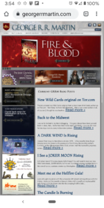
By comparison, George R. R. Martin’s site does not have responsive design. If you visit it on a mobile phone, it won’t look very good.
You’ll have to zoom in and out of the page in order to read that small print. Or maybe it’s just me, and I need new glasses.
But if you click through on any of Martin’s articles, you get taken to a very different-looking site, his blog, called Not a Blog.
His blog uses the free Dark Shop Lite WordPress theme. This is an older theme that hasn’t been updated in a couple of years, but it does have responsive layout and rearranges itself to look pretty good on any device, including phones. Check it out for yourself. Go to Not a Blog, and resize the window. The columns, photos, menus will move around — everything will automatically rearrange itself.
Now try resizing the windows of the other sites on my best sites list, like, say, James Patterson.
Again, you’ll see the content rearrange itself on the page, right in front of your eyes. Images shrink, sidebars move around, menus change shape — it’s pretty cool. And while it’s fun to play with on a computer, it’s critical for visitors using smartphones.
This is called responsive design. If you want your site to look good on different-size screens and mobile devices then this is what you want. Do not, no matter what, let anyone talk you out of it.
The chief alternative to responsive design is to create a separate version of your website for phones. This will double your website costs and create a lot of hassles for you because you now effectively have to main two separate sites. Before that, website designers just made websites extra narrow, so you had big empty blocks on the sides of the site. What a waste of space. And they were still hard to read on mobile devices because, as with George RR Martin’s home page, visitors had to zoom in to be able to actually read the text. If they wanted to scroll, they had to zoom back out, scroll, then zoom back in again.
3. Wide horizontal sections
If you scroll down through any of the sites I listed above, you’ll see that they’re laid out in stripes, or panels — horizontal sections that are the full width of the screen.
I’m going to use Ilona Andrews’ site as an example here, but nearly all of the other sites on my list do something similar.
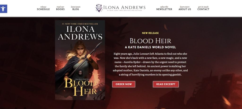
First, Ilona Andrews’ site has a thin panel with a white background at the very top with the site name and main links, which you can see at the top of the image below:
Then there’s a deep, bold panel that goes the entire width of the computer screen with a dark red background, promoting their latest book release. I’m using the pronoun “they” here because Ilona Andrews is actually a pair of authors who write books as a team.
Then there’s a shallow panel with a black background with buttons that take you to their most popular book series, followed by a deep, medium-gray panel promoting their mailing list.
After that, we’ve got a panel with a teal background telling us about who Ilona Andrews is.
Next comes another deep horizontal panel, with a lilac background, showcasing their latest releases.
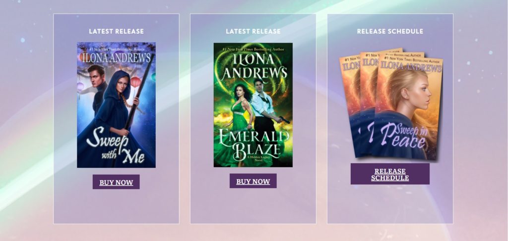
Then comes a row of news posts. There are actually a couple of rows on the site, but I’m not going to take pictures of all of them.
Finally, we get to the bottom of the site and the footer. In the old days, much of this content would have been in a sidebar, taking up key real estate.
All the other websites have similar full-width horizontal blocks. The websites look unique, though, because the colors and background images of the panels are all different.
4. They don’t have sidebars
As you saw above, there wasn’t a sidebar in sight.
In fact, all the modern author sites are full-width, single-column sites that don’t have sidebars.
There’s a navigation menu at the very top of the site, and often one in the footer, and that’s it.
Old sites would often have multiple columns and sidebars packed full of information like site archives and weather reports and calendars and blogrolls and visitor counters and blog rolls.
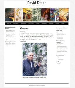
I love David Drake, but his website — you can see the home page above — is a three-column design that was popular about ten years ago.
There are current sites that do have sidebars. News sites and magazines, for example, typically have multi-column layouts. But most other types of companies, as well as consultants, performers, and writers, have been moving to a single-column format.
I admit that Drake’s site is functional and the information on the site is kept up-to-date. The left-hand sidebar lists his latest releases and upcoming appearances. The right-hand sidebar has links to his latest newsletters, some frequently asked questions, and a link to the site map.
I just found out that he has Parkinson’s and had to stop riding his motorcycle. I’m sorry to hear that. Also, he’s posted the outline for his novel What Distant Keeps. Very cool! I love seeing that kind of content, to get some insight into how other writers work.
So yes, he has a very functional website, and I don’t have any problems with it.
It just looks like it was set up a long time ago.
5. They’re designed for impact
Most of the websites on my list have a lot of bold colors on their home pages.
They use bright primary shades or use colorful images as backgrounds for individual sections.
The problem with using lots of colors on a website, especially bold, clashing colors, is that this look is probably going to look very dated soon. Color fashions change quickly.
But if you click through to individual posts, the best sites are designed with a classic style for maximum readability — black text on white backgrounds.
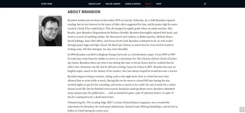
For example, Sanderson’s interior pages all have the same bold header that’s on every page of the site, but if you scroll down, the articles themselves are simple black text on white backgrounds, making them very easy to read.
Having the bold colors on the home page, and simple black-and-white on interior pages is a very good strategy.
To refresh the site, the authors with these modern websites don’t need to do all that much. They just change the home page, the website header, and the footer. They don’t have to redesign the layout of all their internal pages individually.
In addition to choosing colors for maximum impact, the best author sites also pick high-contrast, easy-to-read fonts.
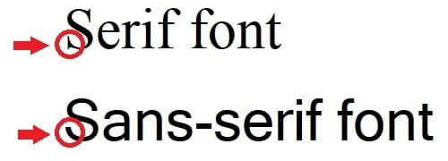
Most use bold, sans-serif fonts for the headings, sometimes with serif fonts for the body of the text.
Sans-serif fonts have no curlicues or extra decorative strokes at the tops or bottoms of letters, but serif fonts do.
A sans-serif font feels a bit bolder, has more impact, especially when used in a heading.
Another way to add impact is by having high contrast between the color of the font and the color of the background. The highest contract is black and white. Other high contrast combinations are white and dark blue or dark red, or black combined with very light colors.
By comparison, a medium-bright color on another medium color is very hard to read. Take a look at this blue text on a red background:
I’m getting a headache just looking at that.
A similar problem is when you have shades that are too close together, like medium red text on a background that’s a slightly lighter red.
The further back in time you go, the more likely you are to find author websites that have these kinds of low-contrast color combinations.
On his home page, George RR Martin has gray and blue text on a light gray background, and light gray text on a dark gray background.
It’s not as difficult to read as some of the other sites out there, but it doesn’t exactly jump off the page, either.
How to get a website that looks like one of those authors
The easiest way to do this is to get a premium hosting account from WordPress, which costs $8 a month and comes with a free domain name. Then go to Fiverr or Freelancer.com and hire someone to set up your site for you. Ask to see samples of their work, and check their reviews.
Tell them which author’s website you like as a model and which theme the author used, and what colors and fonts you want to have on your site. And you better have all the content ready — the images and the text you want to use. Go through your favorite author’s site page by page, and write your own version of that same content, and create your own versions of all their images. You don’t have to have all the pages that your model author does, but you should have the main ones, like the home page and the about page, the contact page, and a blog page. Obviously, don’t copy and paste. Use the model site as inspiration for what types of content you want to have where. Most sites tend to have all the same elements, anyway, just in different combinations.
The freelancer will typically charge you one fee to install the theme and associated plugins, another fee to customize your home page to look like what you want, and then additional fees to set up your main internal pages like the Bio page and the Contact page. Once those key pages are set up, you can do the rest on your own, adding new pages and blog posts based on the models that the designer already set up. In fact, if you’ve ever had a blog, you probably already know how to do this.
Set up a new “page” for anything that’s not dated — you can have separate pages for your bio, contact info, mailing list signup, and a page for each book. Create a “post” for anything dated, like news announcements about book releases, updates from your personal life, your thought of the day, announcements about upcoming appearances, and so on.
You should expect to pay around $500 for a site if you use an off-the-shelf theme. Just avoid any custom coding. You don’t need it, and if someone tries to sell it to you, walk away.
Have all the content ready before you start, so the freelance designer doesn’t have to chase you around for all of it. They will get annoyed, and start charging you extra for the hassle. And I don’t blame them.
For images, use images of your book covers, original art and photography, or public domain images. Check out my article about finding cool images for your posts here.
This website, MetaStellar, uses the free version of the Hoot Du WordPress theme. We have a little bit of custom CSS — email me at maria@metastellar.com if you want to know any details. My personal website, MariaKorolov.com, uses the free BlackWhite Lite WordPress theme.
And no, your website won’t look the same as everyone else’s if you use an off-the-shelf WordPress theme. Your layout will look like other people’s layout, which will make the site easy for your readers to navigate. But all the images, colors, and actual text will be your own, so the site can stand out exactly as much as you want.
Want to learn more? Watch my video on this very topic for MetaStellar’s YouTube channel:

MetaStellar editor and publisher Maria Korolov is a science fiction novelist, writing stories set in a future virtual world. And, during the day, she is an award-winning freelance technology journalist who covers artificial intelligence, cybersecurity and enterprise virtual reality. See her Amazon author page here and follow her on Twitter, Facebook, or LinkedIn, and check out her latest videos on the Maria Korolov YouTube channel. Email her at maria@metastellar.com. She is also the editor and publisher of Hypergrid Business, one of the top global sites covering virtual reality.

